
“A good composition keeps things from floating or flying off the canvas, but a poor composition will ruin an otherwise great work of art.”
Stephen Childs
“Perspective is to painting what the bridle is to the horse, the rudder to a ship.”
Leonardo da Vinci
COMPOSITION
You need to plan your composition as they rarely happen by chance.
Select a good subject that interests and inspires you.
- Subjects that incorporate colour, texture, form, etc
- Study and take note of all these visual elements.
- Look at the source of light and its direction.
What size and orientation is your painting to be?
- Portrait or Landscape?
- Rectangular, square, round, other?
- A subjects size can hugely impact a composition?
- Small subjects diminish their importance
- Large subjects provide a strong focus of attention.
Where are your key points of interest to be positioned?
- To help create the desired emotions, harmony and balance on a two-dimensional surface it is important to consider the placement of your subject and supportive elements carefully.
- Placing your subject and supportive elements centrally, vertically, horizontally and symmetrically may provide stability but this may make your painting appear boring and not attractive or enticing to the viewer.
- Don’t be afraid of cropping your subject or supportive elements throughout your painting as this will stimulate more visual interest.
- Avoid placing your subjects or elements in a way that they are scarcely touching the edges of your paper.
- The ‘Rule of Thirds” is a useful aid to a successful composition.
- The basic principle behind the rule of thirds is to imagine breaking an image down into thirds (both horizontally and vertically) so that you have 9 parts.
- The theory is that if you place points of interest in the intersections or along the lines your painting becomes more balanced and will enable a viewer of the image to interact with it more naturally.
The lines in your composition need to be controlled.
- Your lines will describe the outline and details of your subjects, supportive elements and ‘paths’ into your artwork.
- Vary the thickness, intensity of your lines and occasionally ‘leave out’ areas that the viewer will fill in (remember less is more)
- Your curved, and angled lines will guide the viewer to your key points of interest or the areas that you want the viewer to observe.
- Remember that horizontal and vertical lines will increase strength and impact in your painting, but too many can make it boring.
- Similarly avoid splitting your painting into two exact halves vertically or horizontally, e.g. the horizon as this may create unwanted tension.
Think about Positive and Negative Space.
- A positive space is one that is prominent and appears to stand out separately from the background.
- A negative space is the space around objects.
- Consider equal amounts of positive and negative space to help your artwork ‘feel’ balanced. However:
- Too much positive space creates a sense of being overcrowded.
- Too much negative space will result in your artwork feeling empty and quiet.
- However remember to vary the proportions of positive or negative space to create the impact you require.
Think about contrast
- Try to incorporate a wide range of values from dark to light.
-
Bright highlights, strong colours and/or dark shadows, will help create interest in your artwork and avoid it from feeling dismal or dull.
-
But be careful from placing strong contrast that may distract the viewers attention form your key points of interest.
-
Simplify to avoid distraction.
- Remember the key points of interest in your artwork is where you want the viewer to focus upon.
- If you have too many lines, colours or shapes they will confuse the viewer.
- These are the elements that you need to simplify.
- For example you can simplify by using less intense colour or lines.
PERSPECTIVE
Creating a three dimensional illusion of space and depth
Introduction
There are basically two types of perspective
- Linear perspective
- Aerial perspective
The term perspective is defined in the Collins Dictionary as:
‘The theory or art of suggesting three dimensions on a two dimensional surface, in order to recreate the dimensions and spatial relationships that objects or a scene in recession present to the eye’
‘The appearance of objects, buildings, etc. relative to each other, as determined by their distance from the viewer, or the effects of this distance on their appearance’
A magician uses the sleight of hand to trick the audience into believing what they appear to be witnessing.
In painting and drawing the artist creates a ‘visual trick’ through careful use of linear and aerial perspective to create the illusion of three dimensions on a two dimensional surface.
Although many successful artists have a natural aptitude for applying perspective, it is worth noting that there are certain principles that should be taken into consideration. These are:
Linear Perspective
This term relates to the principle of creating the illusion of depth and space in a composition by the use of converging lines and vanishing points.
- Objects that are the same size will appear to diminish, as they get progressively further away from the viewer.
- Objects that are equally spaced apart will appear to become closer together
- An object that is known to be rectangular or square in shape, i.e. a house, will appear to distort somewhat.
- This also applies to circles and other shapes.
- Your ‘eye level’ will determine the position of the horizon. Whereby all features that are made of parallel lines (i.e. buildings) will converge to a ‘vanishing point’ on the horizon.
- Lines below your eye level will be drawn upwards to the horizon.
- Lines above your eye level will be drawn down to the horizon.
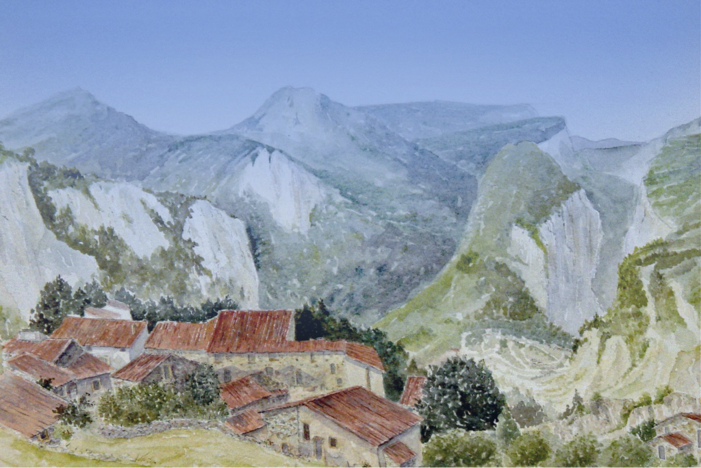
The atmosphere affects light as it travels through it. Aerial (or atmospheric perspective) relates to how the increase of distance changes the appearance of colours and details.
- In aerial perspective colours, tone and contrast will create depth (particularly landscapes and seascapes)
- The distance of a feature will affect the colour (leaning towards blue).
- Colours will fade and this can be over exaggerated to help create more depth and three-dimensional realism.
- Equally details will also be harder to distinguish.
- Warm colours (yellow, red and orange) make the subject or supportive elements in your artwork appear to be closer to the viewer.
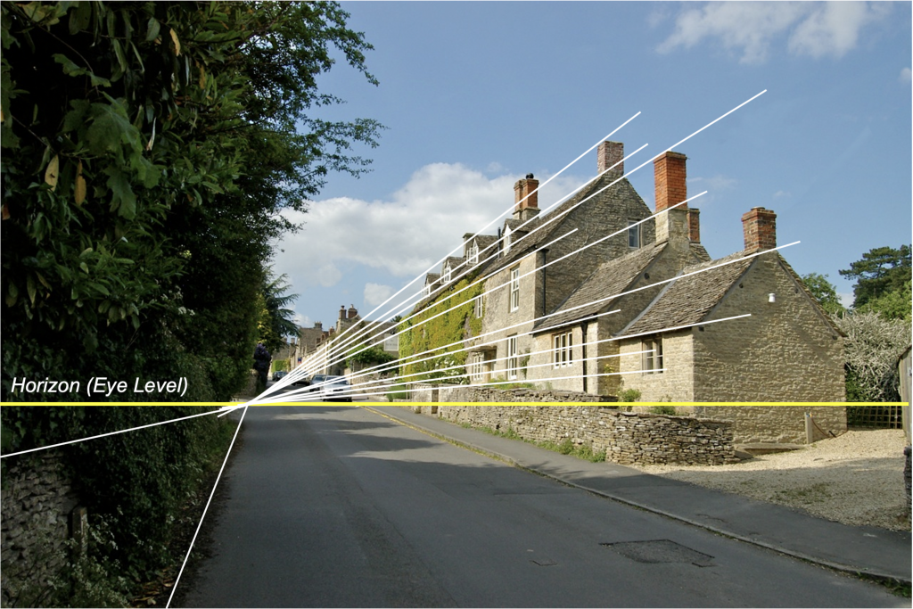
LINEAR PERSPCTIVE
AERIAL PERSPECTIVE
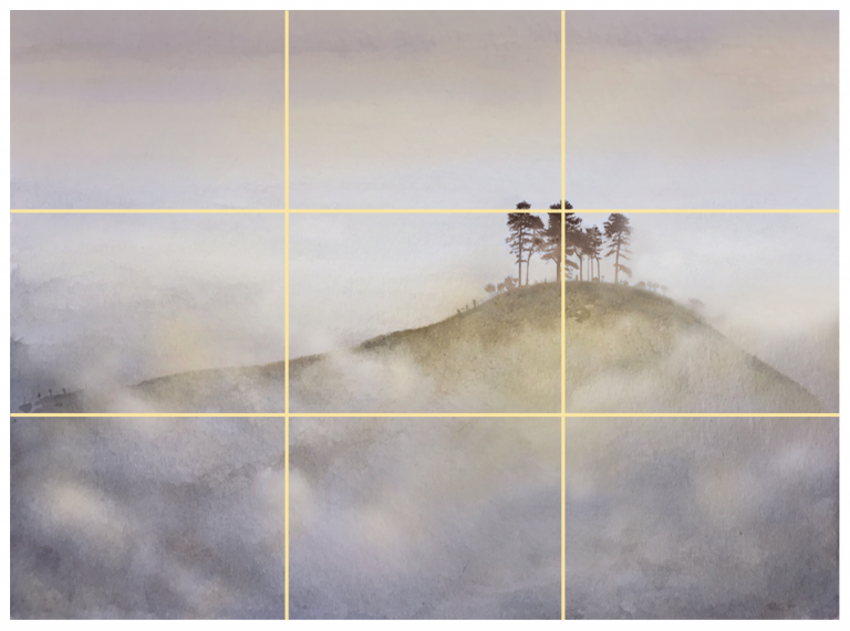
THE RULE OF THIRDS