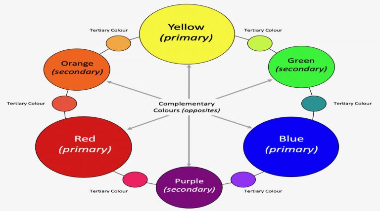
The diagram below illustrates the colour wheel that consists of the primary, secondary and tertiary colours. The three primary colours Red, Yellow and Blue are shown in the large circles. Between each of the primary colours are the secondary colours, shown in the middle-sized circles, which result from mixing the two adjacent primaries. Tertiary colours (represented by the smallest circles) are mixtures of one primary colour and one secondary. As the colours progress around the wheel in any direction, each one is a gradual change from its adjacent colour.
Complementary colours are those that are opposite each other on the colour wheel.
Orange is the complementary of Blue.
Green is the complementary of Red
Violet is the complementary of Yellow.
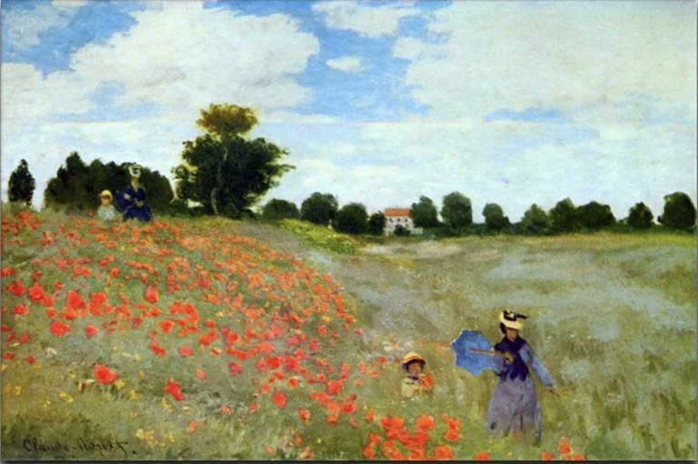
Green is made from the other two primary colours so it contains no red. When these complementary colours are put together in a picture the result is striking – take a look at the Claude Monet painting of poppies in a green field below. Each colour makes the other ‘sing’ and has vibrancy; they also have a tendency to increase the apparent saturation of each other.
True compliments, when mixed together will combine to produce muted browns, greys and a near black colour when all mixed together.
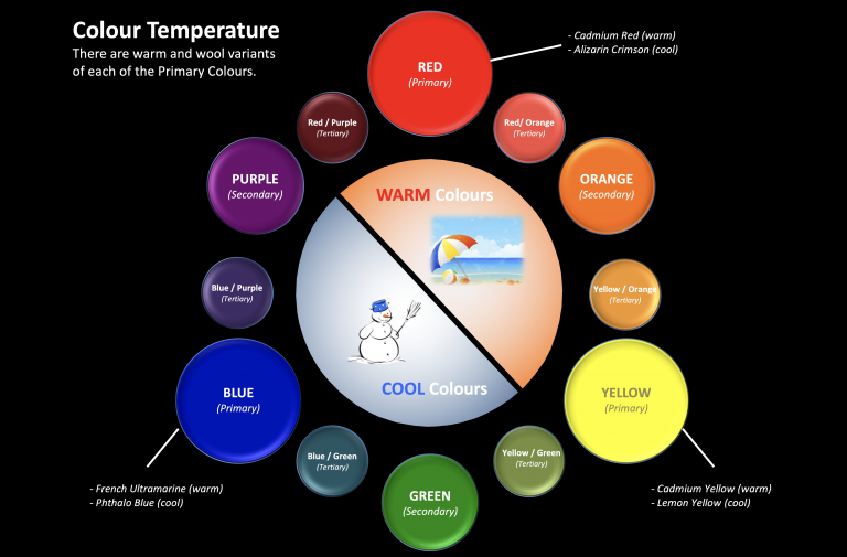
Colour Temperature and selecting the colours for your palette.
It is important to be aware that each of the primary colours have several warm and a cool versions. This is worthy of consideration when deciding upon which paints to purchase and where to use them in your paintings. A simple (basic) palette may be based upon the following:
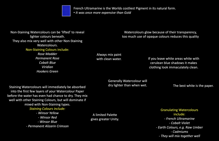
It is not necessary to have a vast selection of colours. A wide selection of colours can be created from a basic or limited palette. The use of a basic palette will also develop the artist’s control and creativity.
Warm Colours: French Ultramarine, Cadmium Red and Cadmium Yellow.
Cool Colours: Phthalo Blue, Alizarin Crimson and Lemon Yellow.
Other useful colours include: Light Red, Raw Sienna, Burnt Umber and Cobalt Blue.
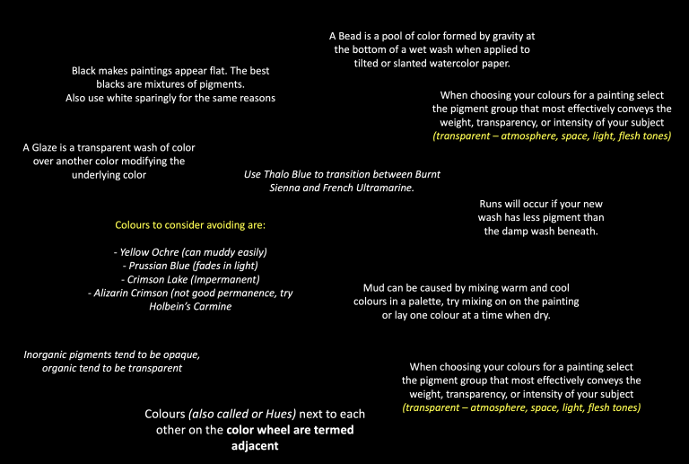
You will notice that I do not include white or black in the basic palette. This is because white will spoil the beautiful transparency of watercolours and black has a tendency to be dull and flat. The best cool or warm black (or dark areas for contrast) are achieved through using strong mixes of the colours in you palette – this also creates greater unity in your work.
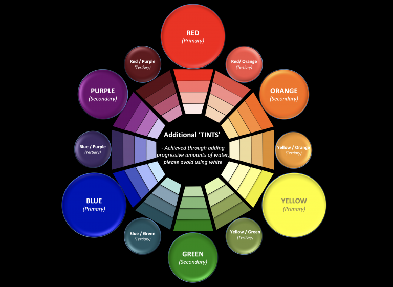
To achieve lighter shades or tints of a particular colour it is advisable to add increasing ratios of water as shown in the diagram below.
The variety of colours that can be achieved from just three primaries – (plus those that can be mixed from complementaries)
Colours that add Mood, Ambiance and Drama
Colours create a wide range of emotional responses:
Red creates an exciting mood – It is the colour of power and passion.
Yellow has a radiant enthusiastic mood – It is the colour of sunshine, and it grabs attention.
Orange gives off a friendly, inviting mood. – It is lively and happy, more welcoming than seductive.
Green, Blue, and Purple are cooler colours and they have the psychological effect of making us feel cool because of the associations with deep bodies of water, open skies, or mountains on the distant horizon.
Aerial perspective makes these colours recede visually therefore making them excellent choices for backgrounds.
Green emanates a calm, tranquil and soothing ambiance. It is natures primary colour.
Blue influences a restful and serene mood. It can also be cold like ice, or calm like a lake.
Purple influences a playful and mysterious mood. It can be elegant or playful, the colour of dream states and fantasy.
The perception of colours becomes altered by:
Other colours being placed near them. (e.g red and green)
The ratio of the space that they occupy.
The texture of the paper being used.
Bright colours can create a playful mood.
Dark, rich colours can lend a sense of drama or mystery
Warm earth colours stimulate a rejuvenating, peaceful and nurturing mood, especially when placed alongside shades of green.
Remember to mix your ‘own greens’ and not to use them straight from the Tube or Pan.
Try mixing green with a range of reds or green with a range of blues)